Dynamicforms Styling
Note: Spartacus 4.x is no longer maintained. Please upgrade to the latest version.
Note: Spartacus 4.x was tested with SAP Commerce Cloud versions 1905 to 2205. Spartacus 4.x has not been verified to work with (and is not guaranteed to work with) SAP Commerce Cloud 2211 or later releases.
Dynamicforms library is shipped with default Bootstrap 4 CSS classes. These classes can be overridden with the custom JSON configuration through the Backoffice.
Table of Contents
Adding Custom CSS Classes
Dynamicforms library uses Bootstrap 4 classes for styling. A custom CSS class can be defined for:
- Form tag - By default empty. This class can be used for specific styling of each form. It can be added by defining “cssClass” property in the JSON configuration.
Example:
{
  "cssClass": "customFormClass", // This can be used to add custom styling class on the form tag
  "formGroups": [
    {
      "groupCode": "firstFormSection",
      "fieldConfigs": [
          // controls defined here...
- Form group (section) - By default, dynamicforms library renders “row” Bootstrap class here. Defining cssClass in “formGroups” section of the JSON configuration will add class to the default class. It can be added by defining “cssClass” property in the JSON.
Example:
{
  "cssClass": "customFormClass",
  "formGroups": [
    {
      "groupCode": "firstFormSection",
      "cssClass": "customSectionClass",  // This can be used to add custom styling class to the section (Form Group),
                                         // it will be added to the existing bootstrap's "row" class,
                                         // in this case each section would have "row customSectionClass".
      "fieldConfigs": [
          // controls defined here...
- Individual control - By default, dynamicforms library renders “col-12” Bootstrap class here, which results in one-column design. Defining a “cssClass” property in the control section of the JSON will add the default class. You can also override the default Bootstrap “col-12” class by defining a “gridClass” property in the same section of the JSON definition.
Example:
{
    "fieldConfigs": [
        {
            "type": "input",
            "name": "firstFormSection",
            "gridClass": "col-6",            // This can be used to override the default FSA (col-12) 1-column layout

            "cssClass": "customControlClass" // This can be used to add custom styling class to control,
                                             // it will be added to the existing bootstrap's "col-6" class,
                                             // so in this case each control would have "col-6 customControlClass"
            "required": true,
            "label": "How much life insurance coverage do you require?",
            "validations": [
HTML
If we consider a form with two sections and one control per section, a basic HTML structure by default would consist of:
<form class=""> // Form class, empty by default
    <div class="row"> // Form Group class, "row" by default
        <cx-input class="col-12"> // Control wrapper class, "col-12" by default
            // Input control-1
        <cx-input>
    </div>
   <div class="row">
        <cx-input class="col-12">
            // Input control-2
        <cx-input>
    </div>
</form>
Adding our classes from examples above would result in the following HTML:
<form class="customFormClass">  // Custom class is added.
    <div class="row customSectionClass"> // Custom class is added to default class.
        <cx-input class="col-6 customControlClass"> // Custom class is added to default class, and grid class is REPLACED
            // Input control-1
        <cx-input>
    </div>
   <div class="row">
        <cx-input class="col-6 customControlClass">
            // Input control-2
        <cx-input>
    </div>
</form>
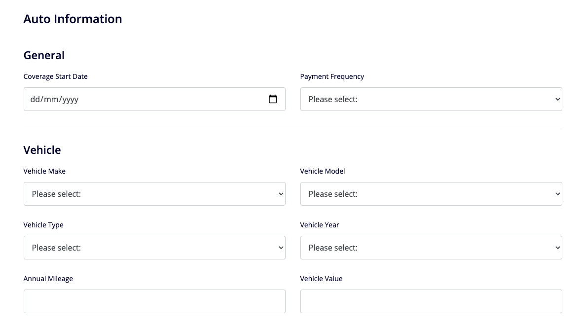
User Interface
Default look of the example form with two sections:
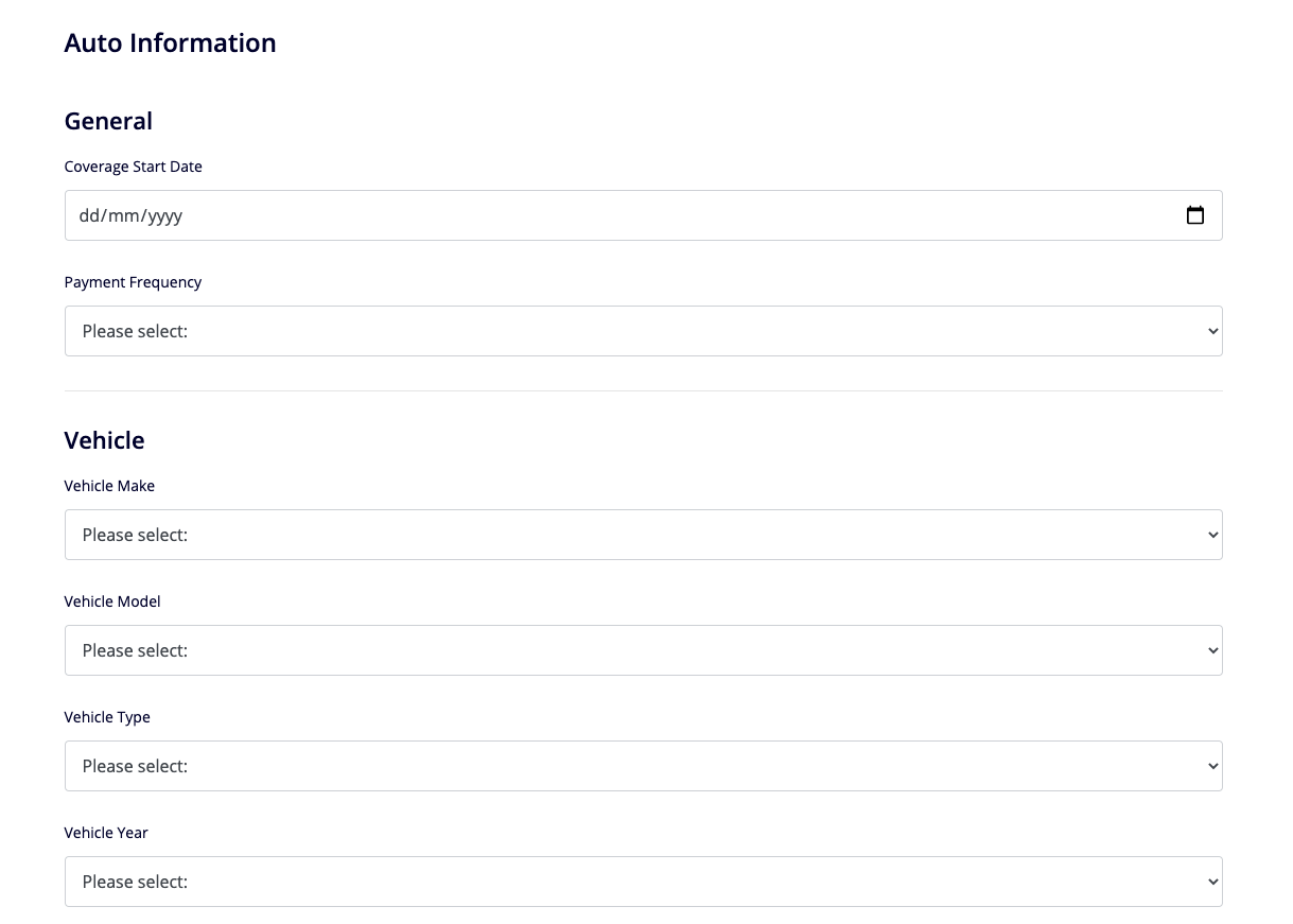
Form look when the default “col-12” class is overridden with “col-6” on each form control, to create a two-column design: