Form Definition - JSON Structure
Note: Spartacus 4.x is no longer maintained. Please upgrade to the latest version.
Note: Spartacus 4.x was tested with SAP Commerce Cloud versions 1905 to 2205. Spartacus 4.x has not been verified to work with (and is not guaranteed to work with) SAP Commerce Cloud 2211 or later releases.
In Dynamicforms, the content, behavior and styling of a form is defined by JSON definition. To create a form, you need to add form controls and define its properties such as control type, name, labels, etc.
Table of Contents
Form Definition Interface
The following interface structure is used to describe a JSON definition:
export interface FormDefinition {
  formGroups: DynamicFormGroup[];
  formId: string;
  cssClass?: string;
}

export interface DynamicFormGroup {
  groupCode?: string;
  fieldConfigs: FieldConfig[];
  cssClass?: string;
  dependsOn?: DependsOn;
}

export interface FieldConfig {
  name?: string;
  required?: boolean;
  disabled?: boolean;
  label?: LocalizedString;
  options?: FieldOption[];
  cssClass?: string;
  gridClass?: string;
  apiValue?: ApiConfig;
  placeholder?: string;
  fieldType: string;
  value?: any;
  hidden?: boolean;
  error?: LocalizedString;
  validations?: ValidatorFunction[];
  dependsOn?: DependsOn;
  prefillValue?: PrefillValue;
  readonly?: boolean;
  maxUploads?: number;
  accept?: string[];
  maxFileSize?: number;
  multiple?: boolean;
}

export interface DependsOn {
  hide?: boolean;
  controls?: ControlDependency[];
}

export interface ApiConfig {
  url: string;
  param?: string;
}

export interface PrefillValue {
  targetObject: string;
  targetValue?: string;
}

export interface ControlDependency {
  controlName?: string;
  conditions?: ValidatorFunction[];
}

export interface LocalizedString {
  default?: string;
  [lang: string]: string;
}

export interface ValidatorFunction {
  name: string;
  arguments?: ValidatorArgument[];
}

export interface ValidatorArgument {
  value: string;
}

export interface FieldOption {
  name: string;
  label: LocalizedString;
  selected?: boolean;
  icon?: string;
}
More details about interface structure can be found below.
FormDefinition
Represents a top-level entity which holds group of form fields.
The FormDefinition contains the following properties:
- formGroups - Defines an array of form groups.
- formId - Attaches ID to the form.
- cssClass - Enables adding unique CSS class to the form wrapper. For more information, see Dynamicforms Styling.
DynamicFormGroup
Represents group of form controls.
The DynamicFormGroup contains the following properties:
- groupCode - Adds the name to the form group which can be found in the payload on form submit. In this example of submitted form data object, form controls are wrapped in two form groups:
groupOne:
    control1: "0"
groupTwo:
    control2: "2020-12-31"
    control3: "YEARLY"
- fieldConfigs - Array of controls in this form group.
- cssClass - Enables adding unique CSS class to the form group wrapper. For more information, see Dynamicforms Styling.
- dependsOn - With this property, you can define the visibility of the whole group by defining control name which the group depends on.
FieldConfig
Represents individual control.
The FieldConfig contains the following properties:
- name - Sets control name.
- required - Defines if control is required.
- disabled - Defines if control is disabled (disabled fields are not submitted to the back end).
- label - Defines control label (supports localization).
- options - Defines available options for the following input types: dropdown, radio button, checkbox.
- cssClass - Enables adding unique CSS class to the form control. For more information, see Dynamicforms Styling.
- gridClass - Enables adding Bootstrap class to the form control to create a grid behaviour in the form. For more information, see Dynamicforms Styling.
- apiValue - Used with ‘dynamicSelect’ control type, to fetch options dynamically from a defined URL.
- placeholder - Sets control placeholder text (if applicable).
- fieldType - Defines type of the field (input, select, radio button, checkbox, datepicker, separator, etc.).
- value - Sets control’s default value.
- hidden - If set to true, control will be available in DOM but not visible on the page.
- error - Defines localized error message for this control.
- validations - Defines validations.
- dependsOn - Here you can define if your control should be visible depending on other controls value.
- prefillValue - Defines if the field should be prefilled with some data (user, cart data from the SPA store).
- readonly - Sets readonly property to the control (Disables control on the UI, the control data is submitted to the back end).
- maxUploads - File upload property, sets maximum number of files.
- accept - File upload property, sets accepted file types.
- maxFileSize - File upload property, sets maximum file size.
- multiple - File upload property, defines if multiple uploads are allowed.
LocalizedString
The LocalizedString contains the following properties:
- default - Sets default label if no match is found for the current language.
- [lang: string] - Sets label for a specific language.
DependsOn
Represents the configuration for defining dependency behavior.
The DependsOn contains the following properties:
- hide - Defines if dependant control/group should be hidden on the page.
- controls - Defines a list of controls and conditions which the control depends on.
ControlDependency
The ControlDependency contains the following properties:
- controlName - Control name which we depend on.
- conditions - Array of validator functions where conditions are defined.
ValidatorFunction
The ValidatorFunction contains the following properties:
- name - Name of the validator function.
- arguments - List of argument strings.
PrefillValue
The PrefillValue contains the following properties:
- targetObject - Targets SPA state object (cart, user…).
- targetValue - Targets a specific property in that object.
Example: Let’s assume that the current user’s first name is required for control prefill. To enable this, we configure the PrefillVallue in a following way:
"prefillValue": {
    "targetObject": "user",
    "targetValue": "firstName"
},
For more information, see Configurable Prepopulate Form Field.
ApiConfig
The ApiConfig contains the following properties:
- url - Defines the API’s URL.
- param - Defines parameters for this API call.
The following example illustrates a “dynamic-select” component that uses ApiConfig to receive options from external service:
{
    "fieldType": "dynamicSelect",
    "apiValue": {
    "url": "/catalogs/financialProductCatalog/valueLists/autoVehicleModel",
    "param": "vehicleMake"
    },
    "name": "vehicleModel",
    "required": true
}
FieldOption
The FieldOption contains the following properties:
- name - Name of the option.
- label - Label for the option.
- selected - Sets default selected option if set to true.
Form Definition Example
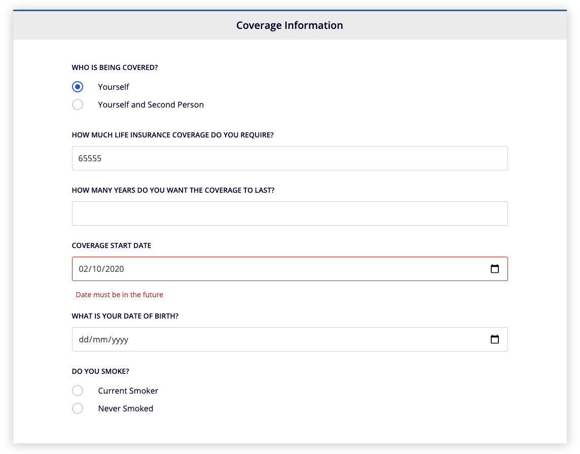
The following example illustrates a form definition used to collect user information for life insurance policy issuance:
{
  "formGroups": [
    {
      "groupCode": "life",
      "fieldConfigs": [
        {
          "fieldType": "radio",
          "name": "lifeWhoCovered",
          "required": true,
          "label": {
            "en": "Who is being covered?",
            "de": "[DE] Who is being covered?"
          },
          "options": [
            {
              "name": "yourself",
              "label": {
                "en": "Yourself",
                "de": "[DE] Yourself"
              }
            },
            {
              "name": "yourself and second person",
              "label": {
                "en": "Yourself and Second Person",
                "de": "[DE] Yourself and Second Person"
              }
            }
          ]
        },
        {
          "fieldType": "input",
          "valueType": "number",
          "name": "lifeCoverageRequire",
          "required": true,
          "label": {
            "en": "How much life insurance coverage do you require?",
            "de": "[DE] How much life insurance coverage do you require?"
          },
          "validations": [
            {
              "name": "number"
            },
            {
              "name": "minValue",
              "arguments": [
                {
                  "value": 10000
                }
              ]
            },
            {
              "name": "maxValue",
              "arguments": [
                {
                  "value": 1000000
                }
              ]
            }
          ],
          "error": {
            "en": "Value must be a number between 10.000 and 1.000.000",
            "de": "[DE] Value must be a number between 10.000 and 1.000.000"
          }
        },
        {
          "fieldType": "input",
          "valueType": "number",
          "name": "lifeCoverageLast",
          "required": true,
          "label": {
            "en": "How many years do you want the coverage to last?",
            "de": "[DE] How many years do you want the coverage to last?"
          },
          "validations": [
            {
              "name": "number"
            },
            {
              "name": "minValue",
              "arguments": [
                {
                  "value": 5
                }
              ]
            },
            {
              "name": "maxValue",
              "arguments": [
                {
                  "value": 100
                }
              ]
            }
          ],
          "error": {
            "en": "Value must be a number between 5 and 100",
            "de": "[DE] Value must be a number between 5 and 100"
          }
        },
        {
          "fieldType": "datepicker",
          "valueType": "date",
          "name": "lifeCoverageStartDate",
          "required": true,
          "label": {
            "en": "Coverage Start Date",
            "de": "[DE] Coverage Start Date"
          },
          "validations": [
            {
              "name": "compareToCurrentDate",
              "arguments": [
                {
                  "value": "shouldBeGreater"
                }
              ]
            }
          ],
          "error": {
            "en": "Date must be in the future",
            "de": "Datum muss in der Zukunft liegen"
          }
        },
        {
          "fieldType": "datepicker",
          "valueType": "date",
          "name": "lifeMainDob",
          "required": true,
          "label": {
            "en": "What is your date of birth?",
            "de": "[DE] What is your date of birth?"
          },
          "validations": [
            {
              "name": "dateOfBirth",
              "arguments": [
                {
                  "value": 18
                }
              ]
            }
          ],
          "error": {
            "en": "Must be over 18 years old",
            "de": "Muss über 18 Jahre alt sein"
          }
        },
        {
          "fieldType": "radio",
          "name": "lifeMainSmoke",
          "required": true,
          "label": {
            "en": "Do you smoke?",
            "de": "[DE] Do you smoke?"
          },
          "options": [
            {
              "name": "Current Smoker",
              "label": {
                "en": "Current Smoker",
                "de": "[DE] Current Smoker"
              }
            },
            {
              "name": "Never Smoked",
              "label": {
                "en": "Never Smoked",
                "de": "[DE] Never Smoked"
              }
            }
          ]
        }
      ]
    },
    {
      "groupCode": "lifeSecondPerson",
      "dependsOn": {
        "hide": true,
        "controls": [
          {
            "controlName": "lifeWhoCovered",
            "conditions": [
              {
                "name": "checkValue",
                "arguments": [
                  {
                    "value": [
                      "yourself and second person"
                    ]
                  }
                ]
              }
            ]
          }
        ]
      },
      "fieldConfigs": [
        {
          "fieldType": "datepicker",
          "valueType": "date",
          "name": "lifeSecondDob",
          "required": true,
          "label": {
            "en": "What is the second person's date of birth?",
            "de": "[DE] What is the second person's date of birth?"
          },
          "validations": [
            {
              "name": "required"
            },
            {
              "name": "dateOfBirth",
              "arguments": [
                {
                  "value": 18
                }
              ]
            }
          ],
          "error": {
            "en": "Must be over 18 years old",
            "de": "Muss über 18 Jahre alt sein"
          }
        },
        {
          "fieldType": "radio",
          "name": "lifeSecondSmoke",
          "required": true,
          "label": {
            "en": "Does the second person smoke?",
            "de": "[DE] Does the second person smoke?"
          },
          "options": [
            {
              "name": "Current Smoker",
              "label": {
                "en": "Current Smoker",
                "de": "[DE] Current Smoker"
              }
            },
            {
              "name": "Never Smoked",
              "label": {
                "en": "Never Smoked",
                "de": "[DE] Never Smoked"
              }
            }
          ]
        },
        {
          "fieldType": "select",
          "name": "lifeRelationship",
          "required": true,
          "label": {
            "en": "What is the relationship to the second person?",
            "de": "[DE] What is the relationship to the second person?"
          },
          "options": [
            {
              "name": "Married Couple",
              "label": {
                "en": "Married Couple",
                "de": "[DE] Married Couple"
              }
            },
            {
              "name": "Common Law Partner",
              "label": {
                "en": "Common Law Partner",
                "de": "[DE] Common Law Partner"
              }
            },
            {
              "name": "Civil Partner",
              "label": {
                "en": "Civil Partner",
                "de": "[DE] Civil Partner"
              }
            },
            {
              "name": "Shared Mortgage or Loan",
              "label": {
                "en": "Shared Mortgage or Loan",
                "de": "[DE] Shared Mortgage or Loan"
              }
            }
          ]
        }
      ]
    }
  ]
}
This is how the form looks like when rendered on the user interface: