Foundation (Atoms)
Colors
Horizon is the default visual style for SAP Products. Its color balance helps to draw the user’s attention to the essential information and functions. It also promotes a distinct and consistent look throughout all products. This also applies to diagrams.
Primary
The primary colors represent the overall look and feel.
| SAP/BTP Area | Non-SAP Areas | Text | |||
|---|---|---|---|---|---|
 |  |  |  |  |  |
| Border | Fill | Border | Fill | Title | Text |
#0070F2 | #EBF8FF | #475E75 | #F5F6F7 | #1D2D3E | #556B82 |
Semantic
Semantic colors can be used to represent a negative, critical, positive, neutral, or information status.
 |  |  |  |  |  |
| Positive | Fill | Critical | Fill | Negative | Fill |
#188918 | #F5FAE5 | #C35500 | #FFF8D6 | #D20A0A | #FFEAF4 |
Accent/Emphasized
Secondary colors can be applied to accentuate important elements. They make a vivid contribution to the overall UI and should be used sparingly.
 |  |  |  |  |  |
#07838F | #DAFDF5 | #5D36FF | #F1ECFF | #CC00DC | #FFF0FA |
Line Styles
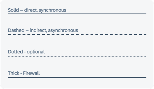
Arrow types in system architectures often represent various communication forms. Their meaning, which can vary based on the specific notation or individual definitions, isn't universally standardized. Generally, a solid arrow means direct communication, while a dashed arrow implies indirect communication. Including a legend in each diagram is crucial to clarify these meanings.
Recommended styles for BTP Solution Diagrams are:
- Solid lines for direct, synchronous request-response data flows
- Dashed lines for indirect, asynchronous data flows
- Dotted lines for optional data flows
- Thick lines for firewalls only
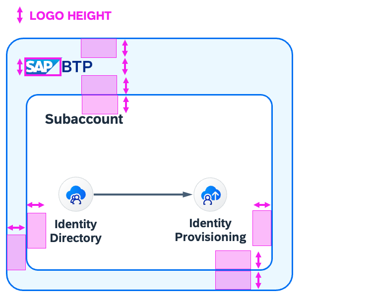
Spacing
Good spacing helps making a diagram look clean and professional. Make sure Elements have enough space to “breathe”. To ensure you have good spacing, this you can follow a rule of thumb: Spacing around objects should be even and roughly the height of the SAP Logo.